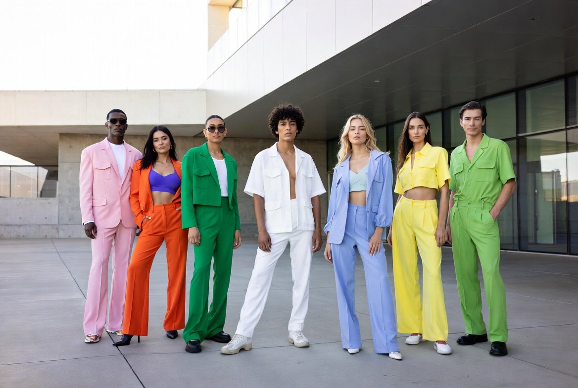
When colors are combined, they usually tell more than any color can alone. With the change in the style, blends become more significant than vivid, single colors. Palettes in 2026 might be tilted towards equilibrium, comfort, and little hints of unexpectedness instead of making a big statement. There are some familiar combinations, others rather gentle surprises, and none of them look hasty or forced. These associations may appear in the house, in wardrobes, in boxes, or in the computer and silently influence the sensations so as not to require any attention. It is centered on comfort, coziness, and versatility, and colors do not stand in opposition to each other. The following are some of the color combinations that may effortlessly enter the daily environment during the course of the year.
Sage green and warm taupe
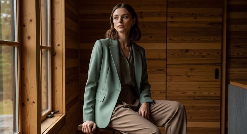
Sage green is usually calming, and warm taupe is a stabilizing factor. When combined, they can have a rustic, age-old quality. It is a blend that may be so natural, subtle, and comfortable to be around.
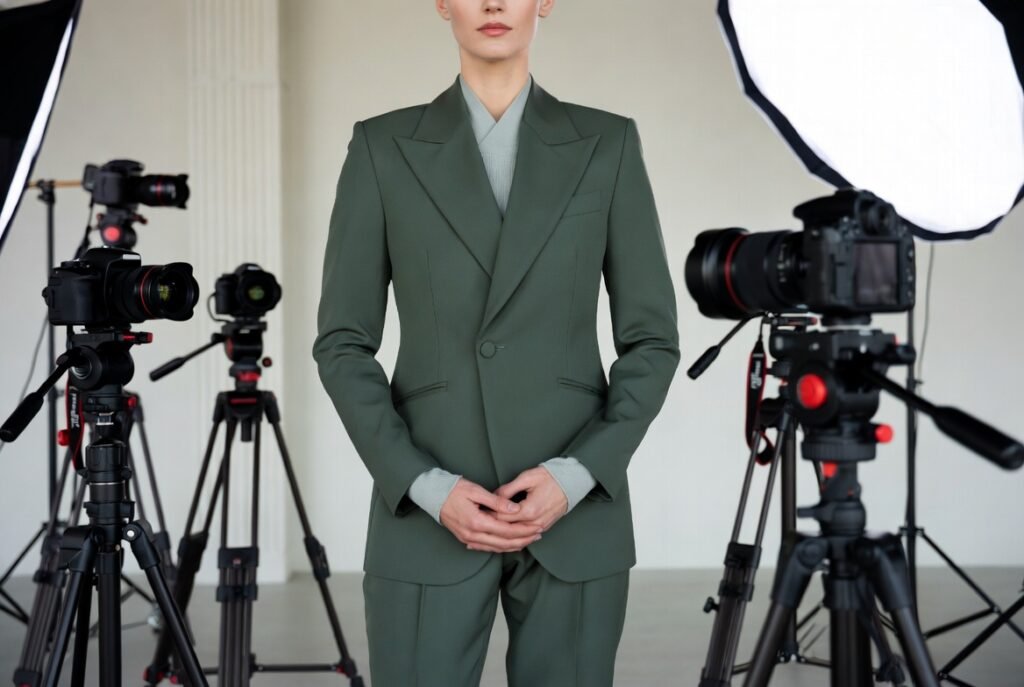
Olive green and faded black

Olive green makes everything organic, and faded black helps to keep everything in check. This combination may seem contemporary but at the same time approachable, not too contrasting but implying a more casual attitude to darker hues.
Warm sand and sky blue

Warm sand is warm and connected to the earth, whereas sky blue is open-minded. They can maybe together imply serene days and expanses. This combination might seem particularly appropriate in an environment where comfort and lightness are appropriate.
Rust orange and soft lilac
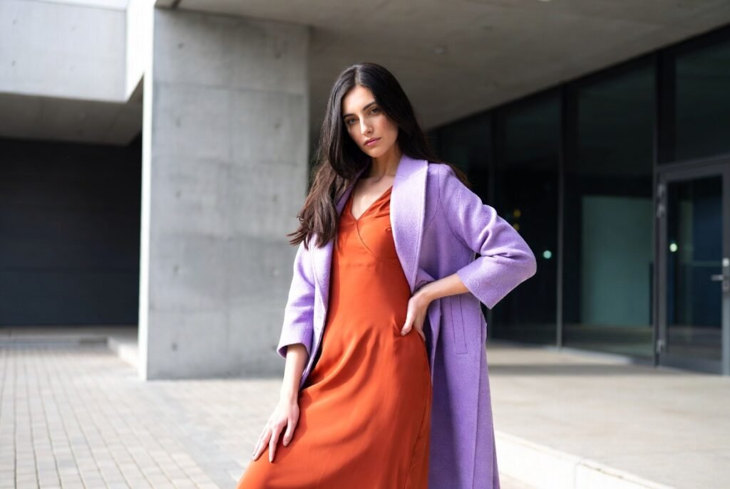
Rust orange is warm and characterized, and soft lilac cools. Such a surprising combination may not be loud and may be creative, and the contrast may be playful, yet still balanced.
Forest green and pale gray
The forest green is rich, and pale gray gives breathing space. When they are united, they can be stable and calm. This combination may be effective in rooms or designs that pursue relaxation.
Butter yellow and cool white
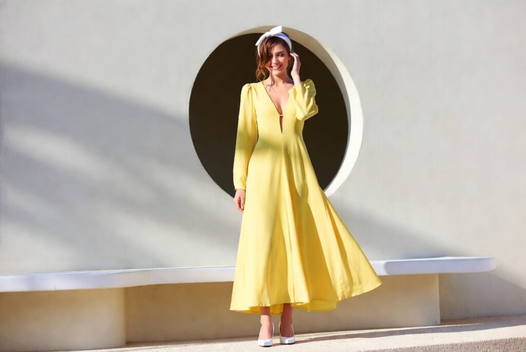
Butter yellow is not intense but rather cheerful, whereas cool white makes everything clean. This combination can be new and optimistic and provide brightness that does not seem overwhelming but natural.
Steel blue and soft beige

The steel blue is structured, and the soft beige is also comfortable. Such a mixture may be exquisitely subtle, providing opposition but not causing any offense or being fixed to a single mood or environment.
Terracotta and pale mint
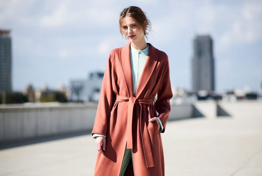
Terracotta is warm and full of history, whereas pale mint is fresh. This combination may seem balanced and maybe even a bit playful, old and new combined in a manner that is easy and relatable.
Ink black and linen white
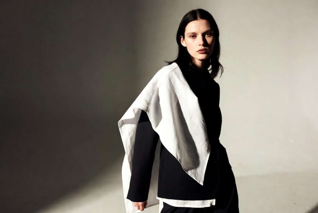
Inc black has texture, and linen white balances the contrast. They can work together to be timeless instead of stark, implying clarity and warmth and allowing texture to shine.
Lavender gray and warm silver
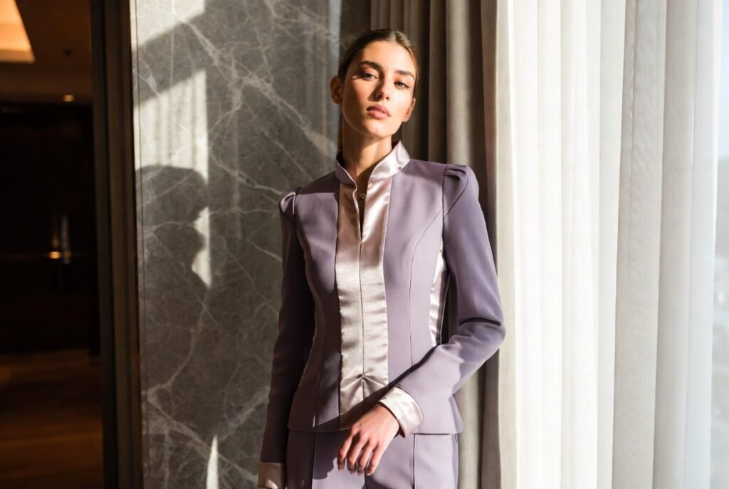
Lavender gray brings out a slight tint, and warm silver brings out a quiet shine. This combination may be contemporary but is relaxing and a soothing sort of twist on neutrals, which is considered considerate and flexible.